My Role
Solo case study for redesigning an existing mobile app
Timeline
August 2026
Assignment
Faster access to routine travel advice
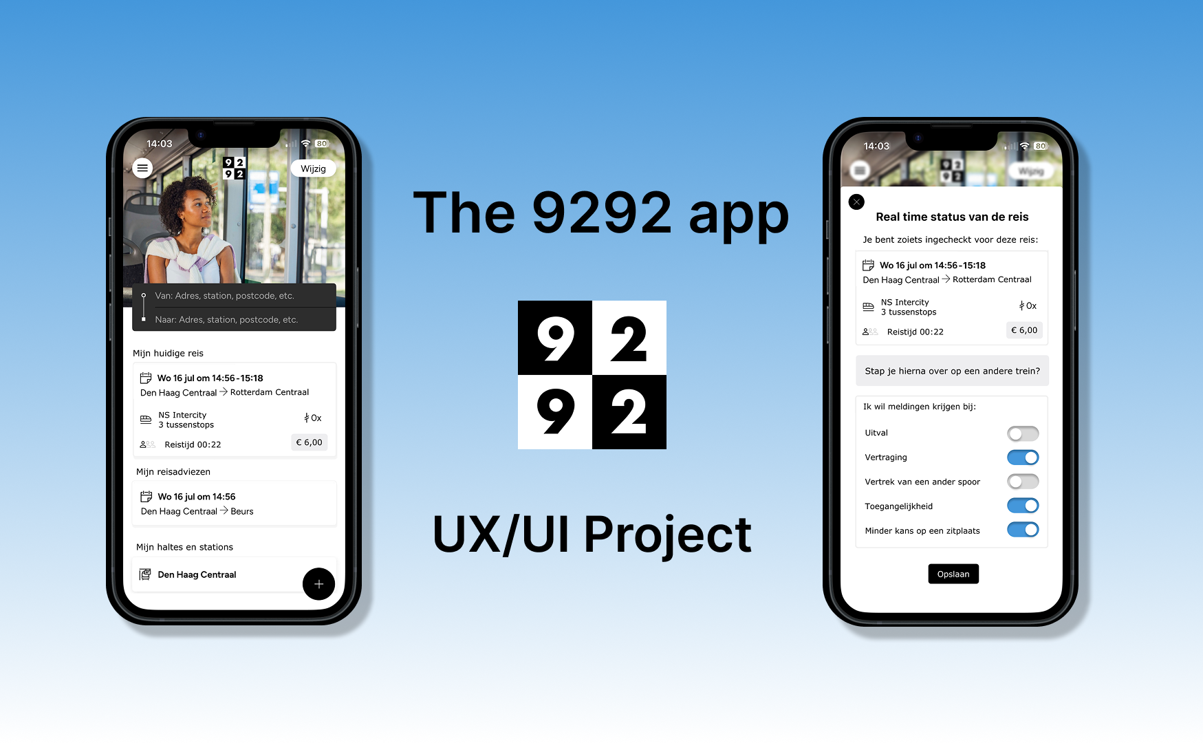
9292 is a public transport journey planner in the Netherlands. The app provides up-to-date travel information, real-time updates and options to customize travel preferences.
Desk research revealed that users who regularly make the same journey, such as commuting between home and work, have to re-enter their departure and arrival locations every time. This makes accessing familiar travel advice unnecessarily cumbersome and slows down the process.
The UX challenge: design a solution that allows users to access their routine travel advice more quickly.
UX Solutions
Four proposed solutions
To make accessing routine travel advice faster and easier, I explored four possible solutions:
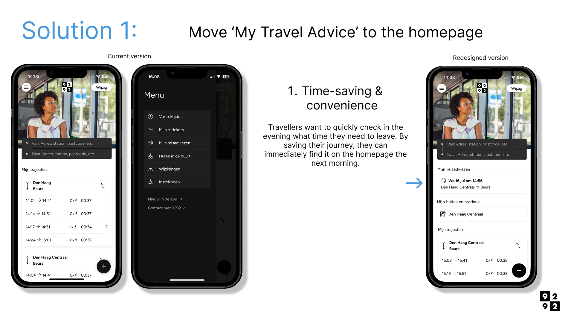
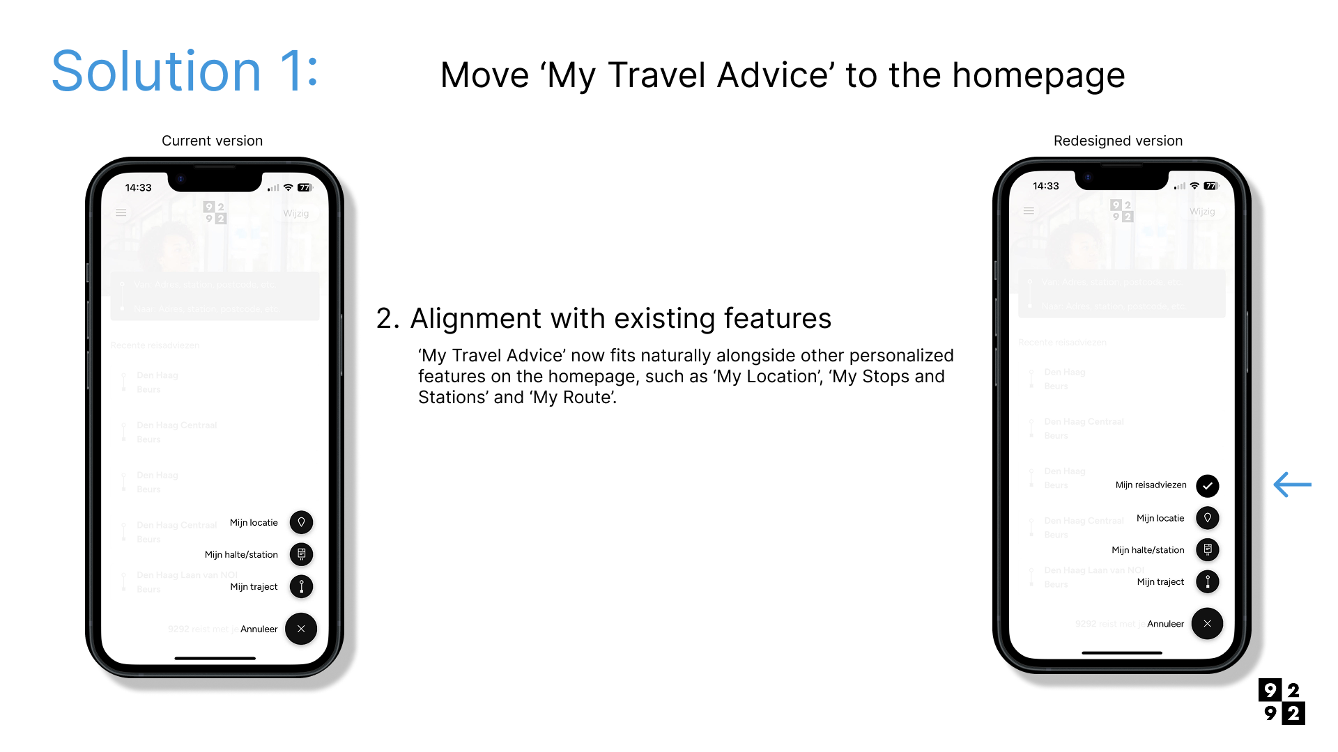
Move ‘My Travel Advice’ to the homepage - Make frequently used journeys immediately visible when opening the app.
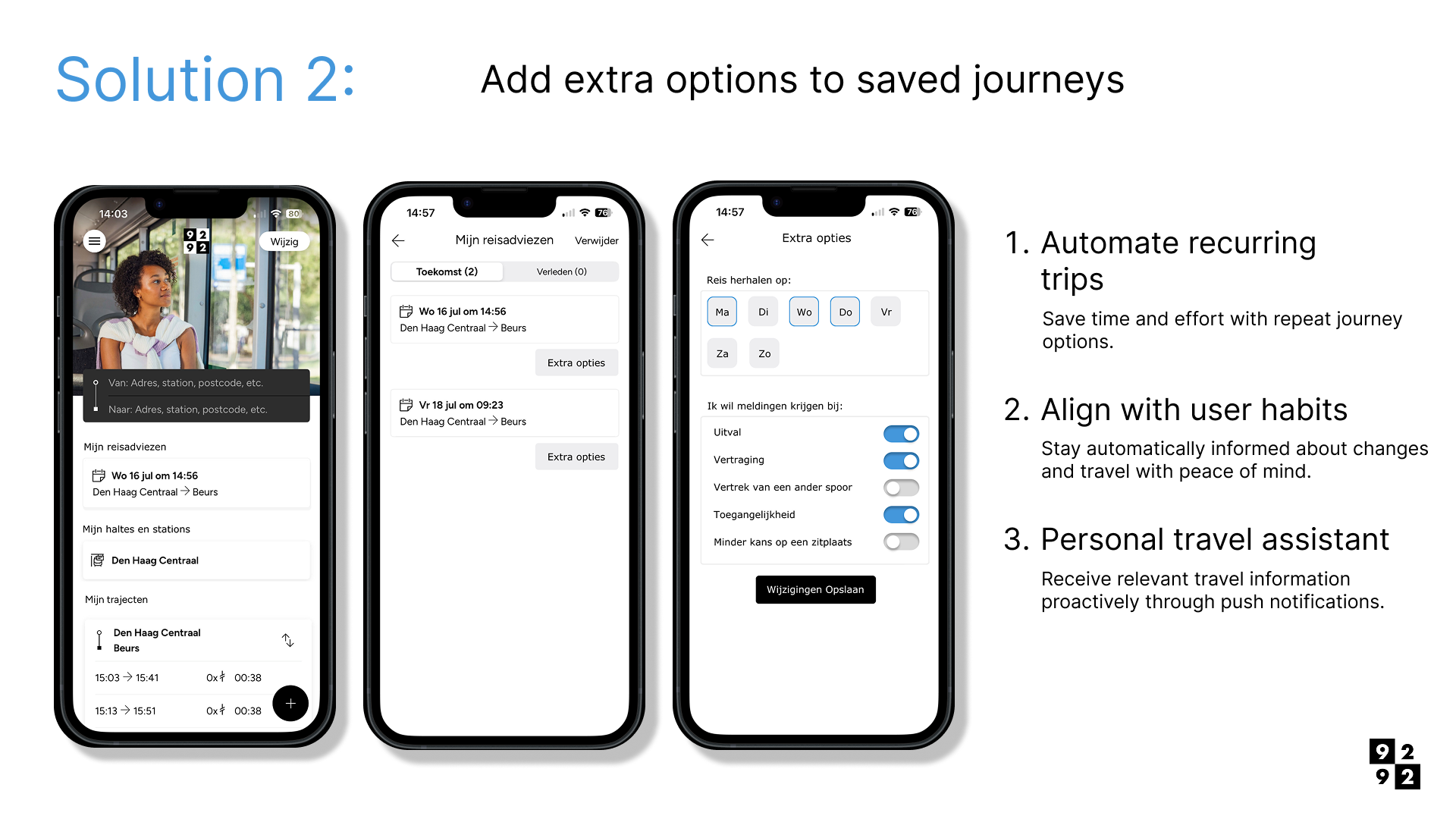
Add extra options for each journey - Introduce additional actions for each saved journey, such as ‘Repeat journey’ or ‘Enable push notifications’.
Introduce a personal account - Allow users to save and synchronize their travel advice through a personal account.
Integrate Google Maps with 9292 - Enable users to open a location directly in the 9292 app from Google Maps to quickly plan a journey.
Solution 1 - Move ‘My Travel Advice’ to the homepage
Make saved routine journeys directly accessible from the homepage.
Solution 2 - Add extra options to saved journeys
Add additional actions for each saved journey.
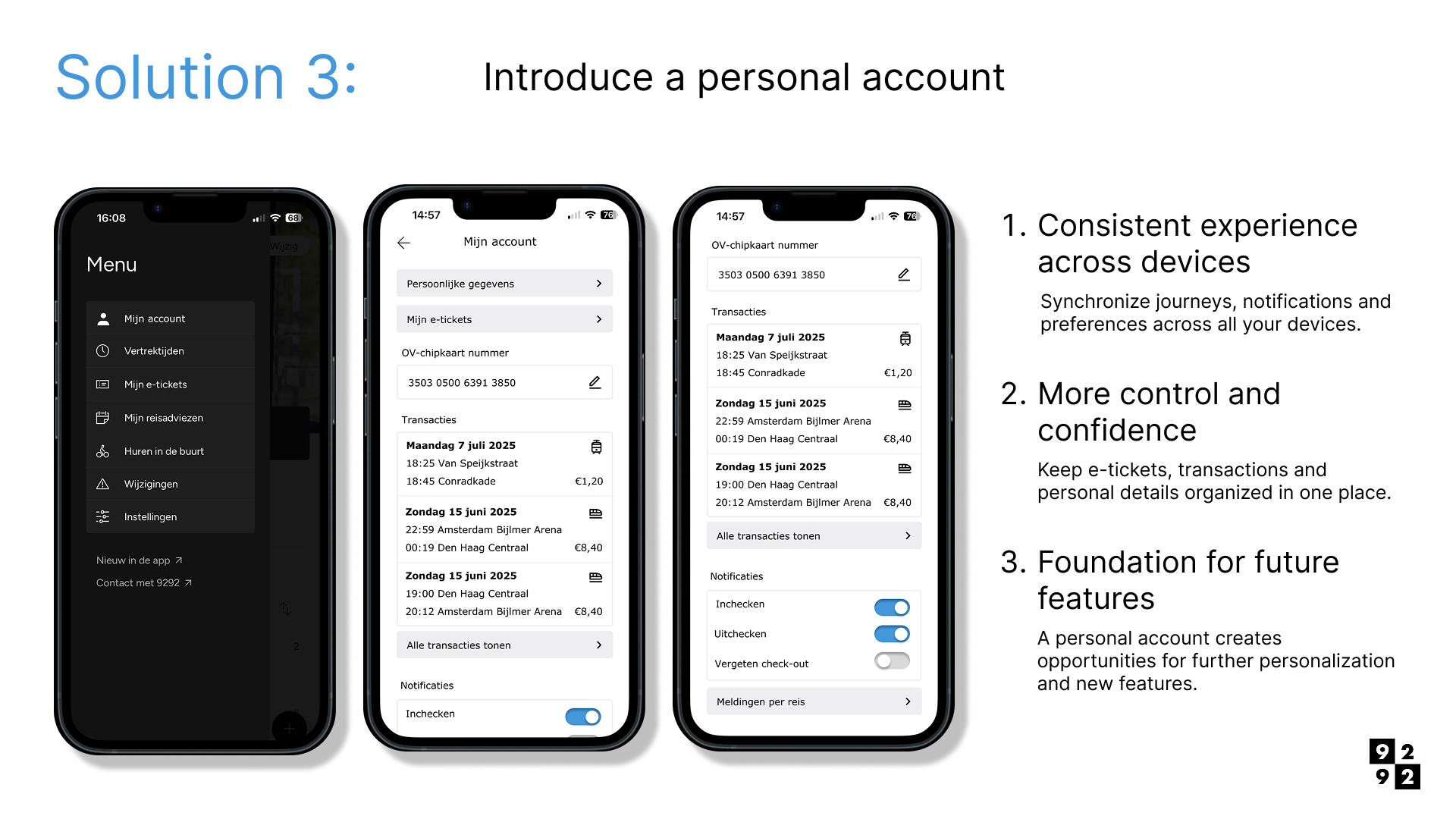
Solution 3 - Introduce a personal account
Allow users to save and synchronize their travel advice through a personal account.
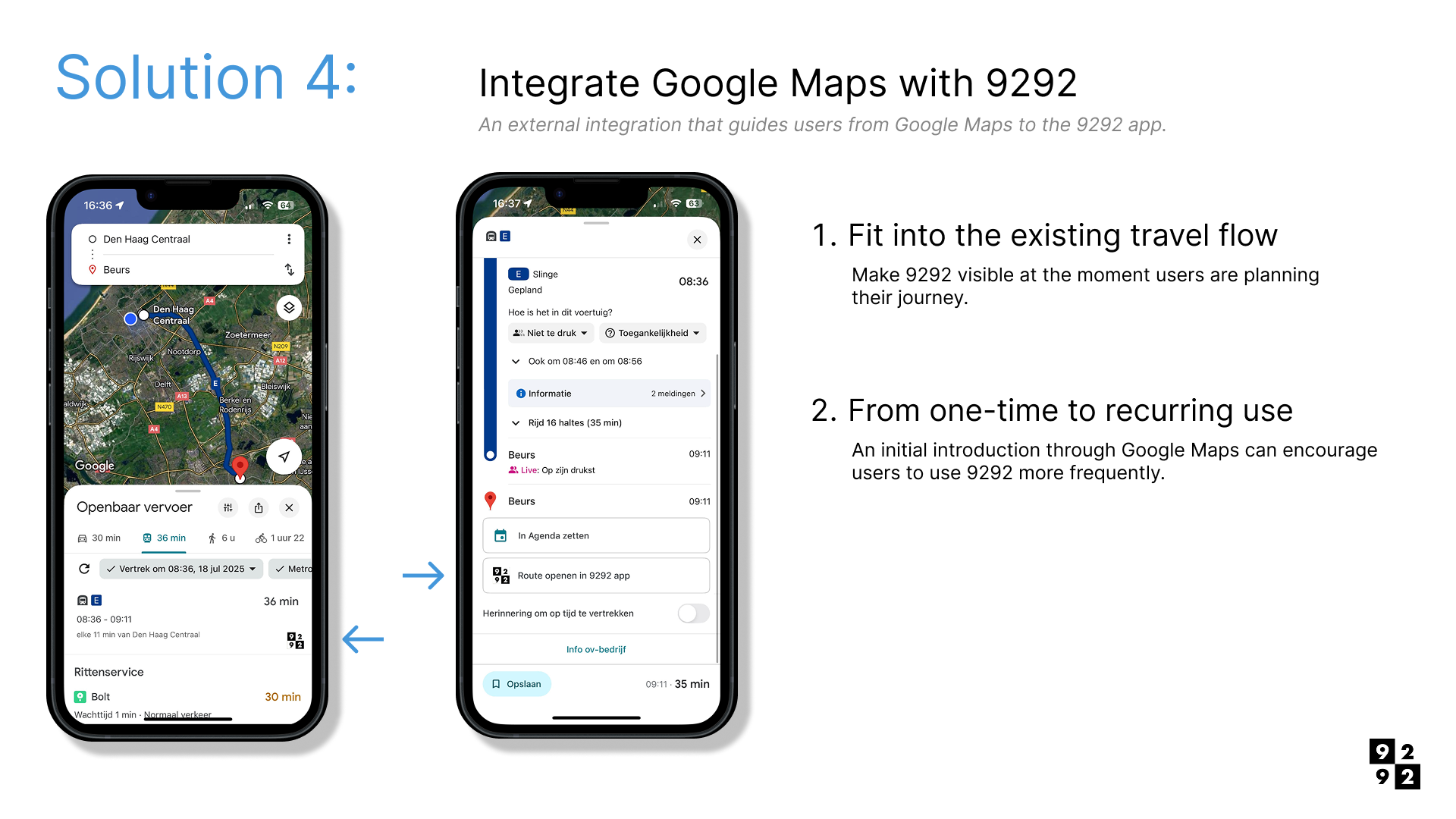
Solution 4 - Integrate Google Maps with 9292
Allow users to open a location directly in the 9292 app from Google Maps to quickly plan a journey.
Conclusion and GIF
Final concept
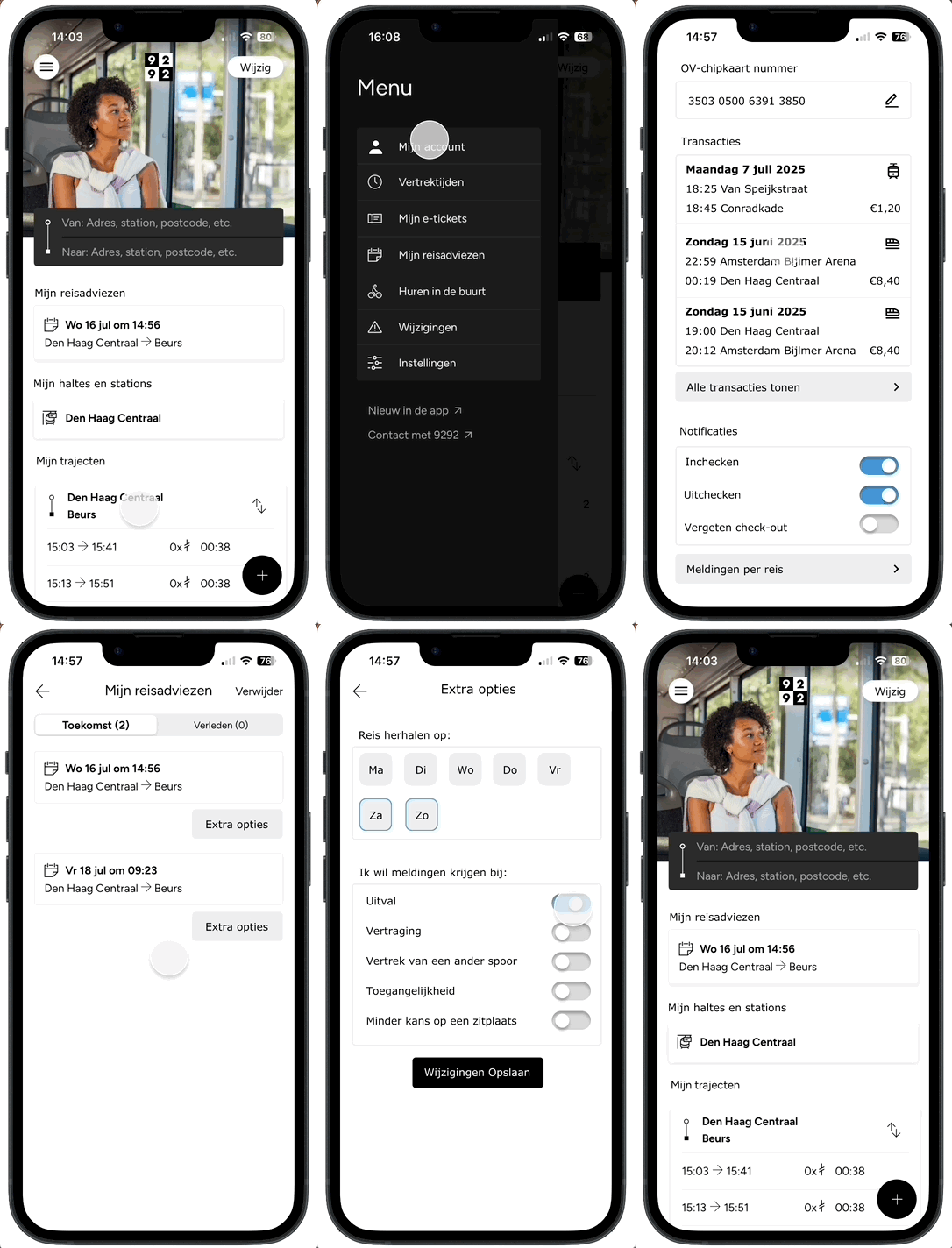
Based on the different solution directions, I developed a final concept focused on making recurring travel advice more accessible. The main solution is to prominently feature ‘My Travel Advice’ on the homepage, allowing users to quickly find their regular journeys without having to re-enter their departure and arrival locations each time.
In addition, I introduced the option to set a journey as a recurring trip, allowing users to configure specific days and notifications. This makes the app better suited to users' daily routines and ensures relevant travel information reaches them at the right time.
The final user flow demonstrates how users can select a saved journey from the homepage, adjust their journey settings and quickly access their desired travel advice.
Reflection and next steps
Reflection
This UX case study showed me how a relatively small pain point in an existing user flow can lead to several possible design solutions. By first focusing on the users' needs and then exploring multiple approaches, I was able to compare different ways of addressing the same challenge.
A logical next step would be to test the concept with users. In particular, the repeat journey options, notifications and amount of information displayed on the homepage would benefit from further exploration. I would also want to test which of the proposed solutions provides the most value for users who regularly make the same journey.
Additionally, some ideas, such as the Google Maps integration and a personal account, depend on technical and organizational feasibility. I would explore these further with stakeholders as part of a follow-up project.