
My role
Timeline
Solo case study
May - June 2023
Edits : September 2023
aSSIGNMENT
eCommerce purchase via app
In May 2023, I took my first user experience course through the online platform Udemy. In this course, I was given a case study on how an eCommerce purchase is made through a mobile app. In this, I had to invent a fictional coffee company and design an eCommerce app for it. The assignment was to go through the buying process of a customer who wanted to buy a new coffee machine through the app. The course also involved creating a persona who was the perfect customer for your fictional coffee brand.
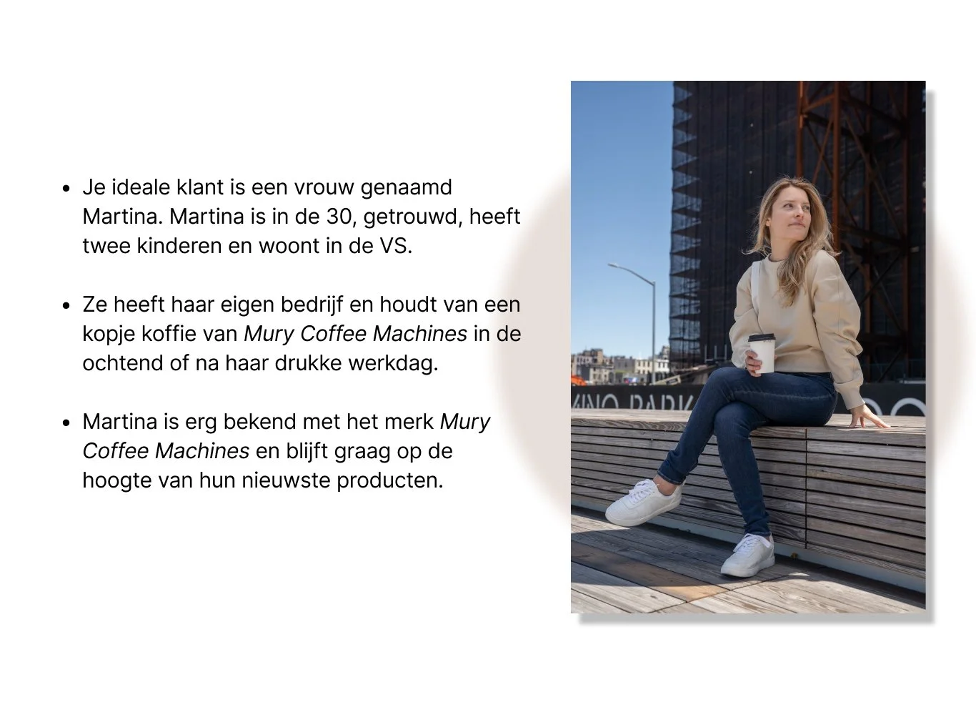
Persona
This is Martina

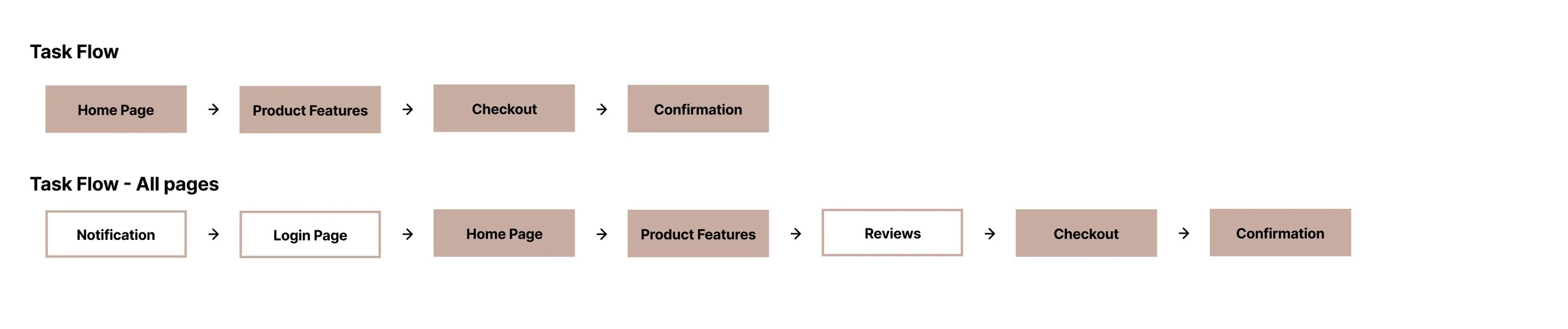
Task Flows
Two task flows are designed to move through the buying process
The first task flow consists of four main pages that must appear in the app to complete the eCommerce purchase. The second task flow consists of three additional pages that I added myself to add more detail and expand the buying process.
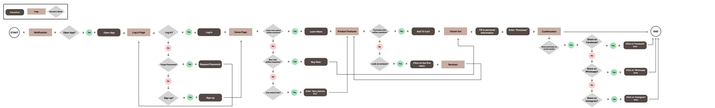
User flow
All the steps a customer goes through in completing a buying process
Based on the task flow, the user flow was created to show how a customer completes a purchase from start to finish (zoom in on the picture to read it properly).
Wireframes
Taking inspiration from existing coffee brands
To properly visualize what Mury Coffee Machine's app will look like, I first created the structure wireframes in Figma. In doing so, I looked at several apps and website designs from existing coffee brands such as Starbucks, Douwe Egberts, Nescafe and Nespresso. I went through the buying process of these companies to get inspiration for designing my own wireframes.

low-fidelity prototypes
Add small text and icons
After creating the structure of the wireframes, I went on to create the low-fidelity prototypes in Figma. In doing so, I looked at where text and images would appear in the app. I also added small icons to the prototypes.

Testing first Prototype

Image: First prototype with dark color palette
3 major improvements in my design
In my first prototype, I used a lot of dark colors for the design of the app. I was told through mentors at Udemy that my color palette was very dark in my first prototype. As feedback, they advised me to lighten the colors and create a more subtle background in my design. In addition, I found out that the original format I used was a little too small for a standard cell phone app in 2023.
Final Product
The final product
After hearing this instructive feedback, I changed my design in September 2023 to a lighter version with more subtle colors, fewer background images and a larger size.

Gif of the final design
Reflection & Conclusion
What would I do differently next time?
Repetition is key. In the early stages, I explored so many different options to find the right solution that I ended up restarting several times with different versions in my Figma file to make sure every aspect of the app was purposefully designed. I spent a lot of time on this. But as a result, I did incorporate UX Design guidelines and WCAG standards very deliberately into my designs. It also helped me to master all the ins and outs of Figma.
Asking for feedback earlier. I had completed my first UX design for this app without asking for feedback in between. Only when I was almost finished did mentors on the Udemy platform say that my color palette was a little too dark in my first prototype. In addition, my original format I used was also too small for a mobile app in 2023. Because I had not asked for feedback earlier, I actually found this out too late and had to adjust my design at the end. I will ask for feedback earlier in the future to avoid this.